

Overview
This project has to do with redesigning the whole UX of Real Geeks websites. Real Geeks is a IDX/CRM provider for real estate agents all across North America. Real estate agents rely on the front-facing website to help them attract real estate leads by providing live real estate listings in their respective markets, and providing content through relevant content and blogging. Think Wordpress but for real estate agents.
The Goal
A challenge was not just to tackle the sheer outdated look of these default websites, but also provide a prospective buyer or seller an easier UX to find listings or important information easier, in a more luxurious fashion. Due to the vain, competitive nature of real estate — agents need to do everything to stand out in their respective markets. So the sites need to look incredible, the branding needs to be slick and easily recognizable, and the site needs to be easy to navigate with strategically placed call to actions to ensure the highest conversions.
The Outcome
The outcome of this redesign was that any respective Real Geeks site that we redesigned would increase in conversions, lower in bounce rate, and simultaneously create more brand awareness. These sites would have many new calls to actions that would invite new lead opportunities, and the brand direction would be clear and concise throughout the site
Responsibilities
UX & UI Design
Consulting client on UX direction
All UX/UI designing
CTA implementation & strategy
Brand direction / identity
Consulting client on brand direction / identity
Coordination with vector artist
Choosing tones/colors for site
Logo design adjustments through Adobe AI
Brand uniformity on website and marketing
Front End Development
HTML
CSS3
JavaScript/Jquery
Django Administration + Page Creation
Managing additional developer for additional JS adjustments
Problems
Outdated sites, bad visibility on call to actions
The site is lackluster and outdated out of the box. The hero section contains an all-too-complex dropdown search section for listings. Today’s consumer is used to a simplistic type style search bar at the beginning of the customer journey, which I will cover in the research section below. The site displays listings in a way that shows way too much information upfront as the user searches. There is too much whitespace. The photos are also too small and just don’t fit stylistically with what today’s consumer is used to. The sign up forms are quite messy as well and visually seem spammy. Everything needs work here.Lack of call to actions out of the box
The site will prompt a user to sign up only when they go to view listings, but many of our clients have opted to turn off the sign up form due to most national websites like Zillow and Redfin not requiring forced sign up. This leaves us to create more value through creating new, enticing calls to actions. The site also doesn’t have any custom forms, except a basic contact form — which doesn’t collect crucial information that our clients want from prospective buyers + sellers.Poorly designed area pages/content pages
Many of our clients use Real Geeks for this capability to generate long term business through SEO. Real estate websites do well with SEO when they have robust area pages that highlight cities/areas in their respective real estate markets. Real Geeks leaves our clients to create their own pages, and 99% of our clients do not know how to create these pages. This leaves us to create robust, reusable area pages that help our clients inform their prospective clients about an area clearly, and placing important information and calls to actions to help them convert more leads.The Design Process + Branding

Chrome Dev Tools
Because I am also a front end developer, I find the easiest way to design is through Chrome Dev Tools. It’s very dynamic and quicker than first conceptualizing on Figma. Using file overrides, I can quickly create live elements and visually discern whether the UI will flow nicely on the site. It also allows me to make adjustments to the behavior with Javascript and realize the full vision before making commits to the files.
Brand Direction
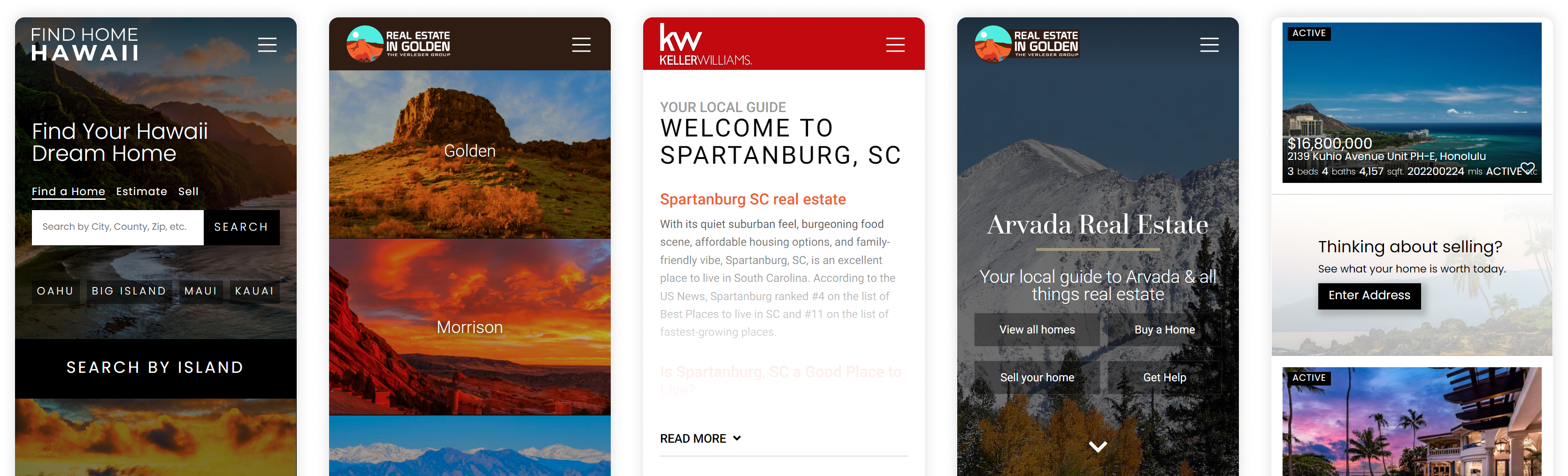
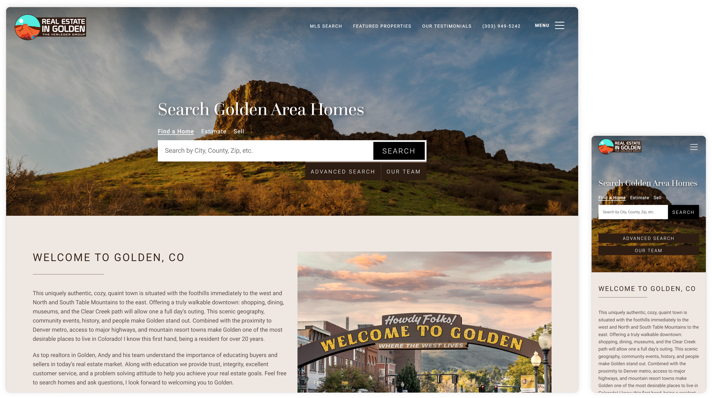
 We will use our client, a Real Geeks user, RealEstateinGolden.com as an example for this case study. Our client is the #1 real estate agent in Golden, CO and trusted us to overhaul their site experience. They also wanted us to help with brand direction and develop a new identity + logo. They needed to be showcased as the clear choice in Golden, CO real estate, but simultaneously convey the message that they are experts in surrounding city real estate as well. As far the brand identity goes, having a logo that represented the topography of the area was important (they wanted a design that incorporated the Castle Rock mesa, a local monument shown above), and having a slick color scheme that fit the feel of the area nicely whilst retaining a luxury feel on the site itself. I believe we accomplished this with these pieces.


UX Improvements, changes, & additions
Many components of our UX overhaul have a clear difference between old and new elements and direction. Some are new additions to enhance the customer journey and value-adds to increase conversions and the over experience.
Area pages

Hero section
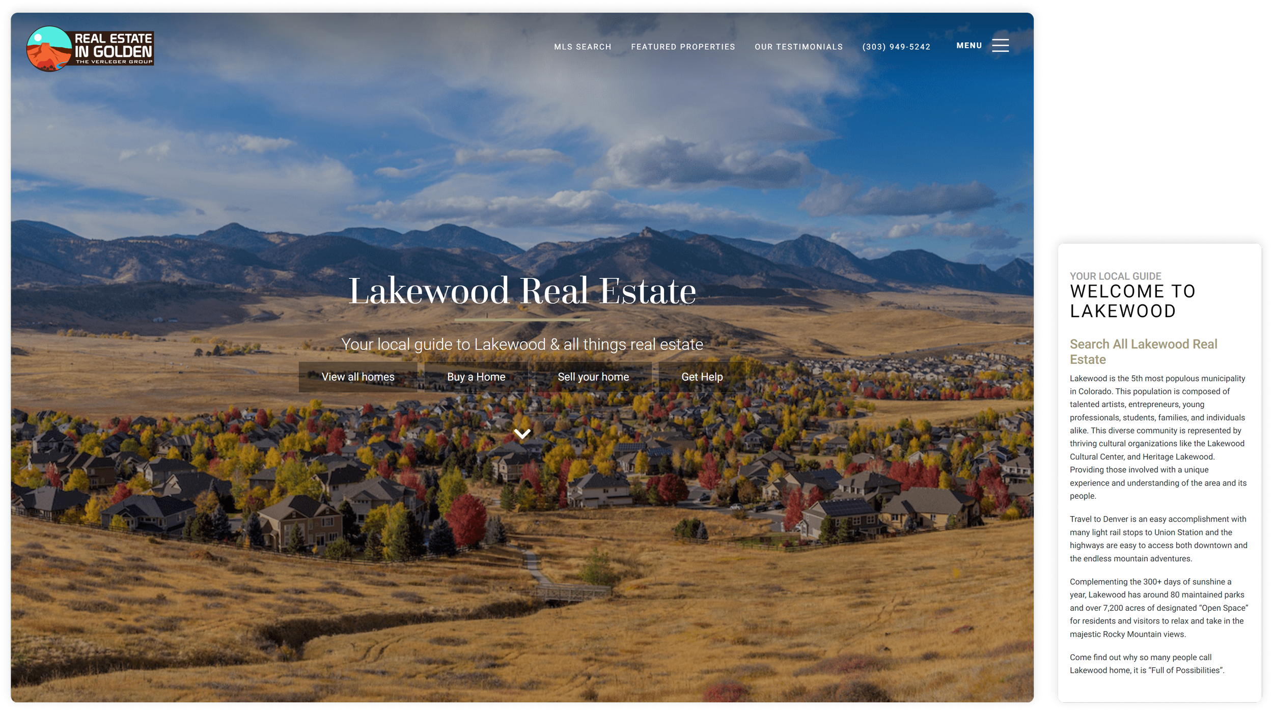
Area pages are important to this business because it solidifies our clients expertise in any given area they service, is a SEO tool to attract traffic, and is a massive lead conversion tool with strategically placed call to actions. We start here with a hero section with multiple calls to action that would cater to a visitor. This was much better than a search bar before as it gives the user multiple ways they can navigate the page based on their needs.

Area intro
Upon either choosing a call to action (which scrolls the user smoothly down the page to a given section), or scrolling down the page, they are greeted with a blurb of the area. If a given area page has a ton of copy written, our design will truncate the text into an expandable section to keep the page height as short as possible — so the user is aware of the next important section: real estate listings for that area.

Listings
Prior to the overhaul, the listings that would populate on any page would be a giant grid. Due to these pages having so much important content to see, we needed the grid to take up way less space, but still provide the same feed. We truncated the grid into an overflow horizontal slider. On mobile, it would show one listing at a time, with an option to see the entire list by the click of a button. This was a huge space saver so the user could easily navigate to the next section.

Market Snapshots
We wanted to provide a dynamic, slick section to display a live market snapshot of a specific area's real estate market. We designed a section that displays important information that automatically updates with a script that grabs information for other areas of the site so the user doesn’t need to navigate to a different page to see the same info.

Home value widget & listing alert CTA
The next sections would provide a slick home valuation widget and a call to action to sign up for listings. Simple, secondary calls to actions based on a visitor's motivation.

Agent call to action section
The last section is a last big call to action that displays the agent’s picture, a few calls to action, and dynamic headers that solidifies Andy’s expertise in that particular area. It’s sleek, resizes beautifully on mobile, and ensures the visitor feels welcome to inquire.
Calls to action
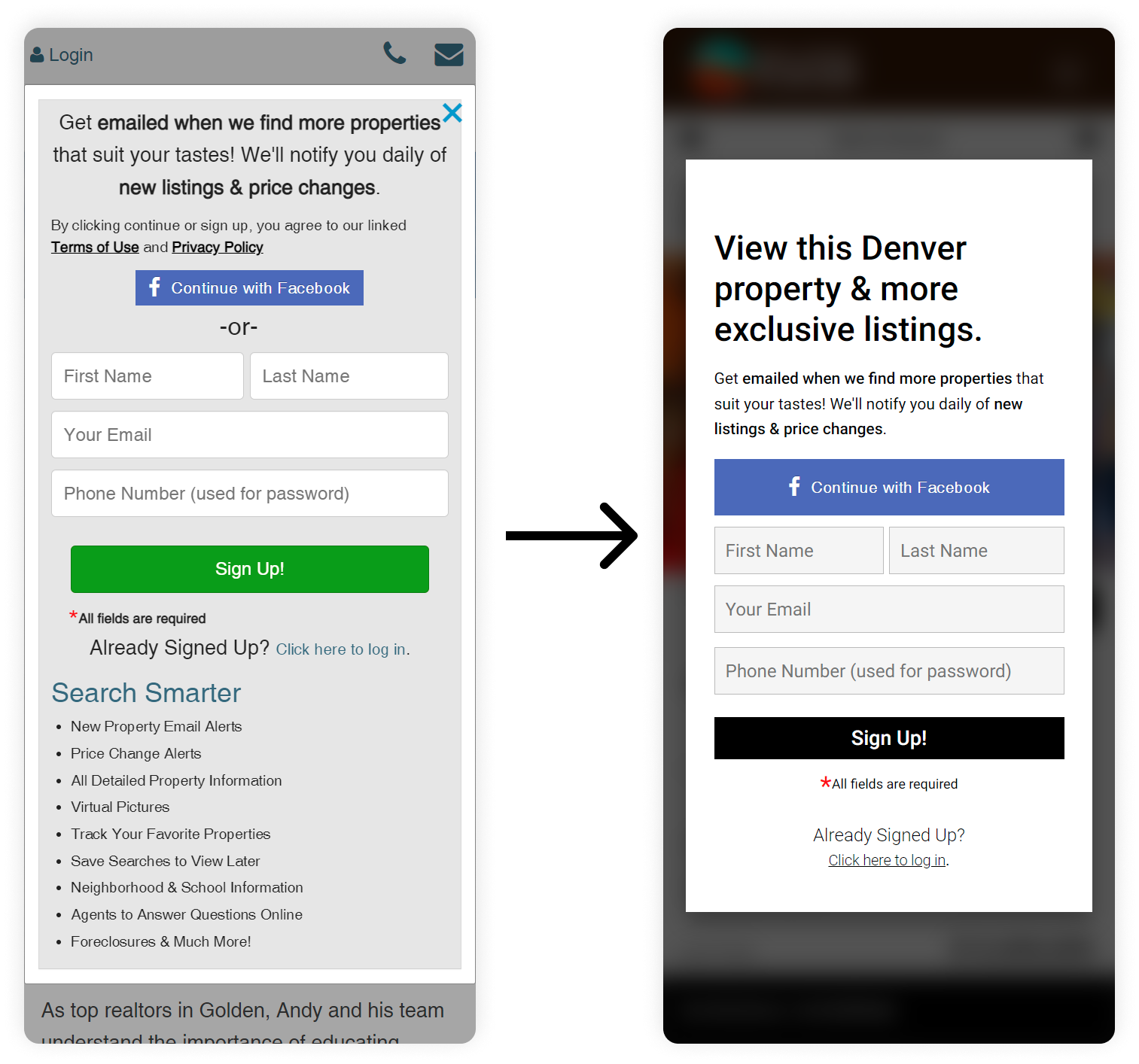
Sign up forms
A big lead conversion tool on the website are the sign up forms. Prior to the redesign, the site featured an extremely cluttered sign up form that looked like a sales pitch. We also noticed that these forms did not populate messages based on the users actions. So we first simplified the forms and removed all the text. Secondly, we developed a script that would adjust the call to action header based on the user's action. So if a user tried to favorite a property, instead of displaying “Sign Up For an Account”, it would display “Save this Denver property to your favorites”. A big UX and conversion helper.
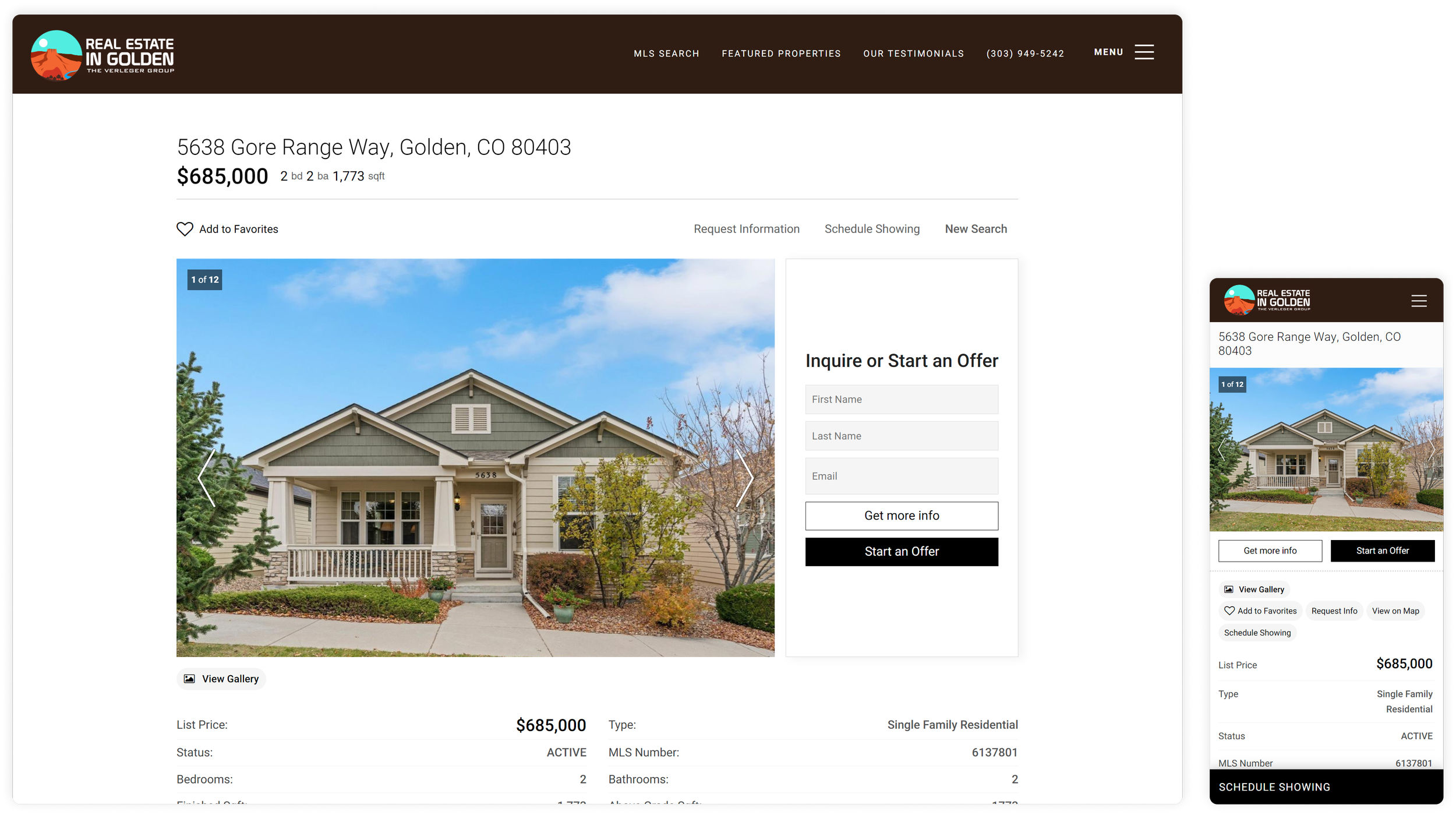
Listing results pages
Due to this site being a home search site at its core, a user of this website would be spending their time mainly on pages that populated a list of listings. We decided to redesign these pages into a grid that removed description text and increased image sizes, while retaining important preview information that overlapped the listing images with a subtle background linear gradient for readability. Our client also wanted to attract home sellers, so we added a “Thinking about selling” call to action form that would seamlessly fit between the grid after a set amount of listings. The call to action would lead the user to a form to enter their address to see their home valuation.


Custom forms
We had a big challenge with the sites built in forms. The only way that a user could submit a form was by clicking a link that would popup a modal with a basic form. The Real Geeks site out of the box did not have an option to create forms at all. So we got creative here. We developed a static form that we could add all our clients needed fields to gather specific information from their clients neatly. We designed a script that would gather that information, and then on submit, would then ask for the user's phone number, compile the form information, and submit via the original contact form in the background. Worked like a charm.
Additional UX improvements

Smart account section
We noticed the site lacked a real section to help users navigate to their account info and saved listings/searches. So we created a dynamic section that would populate a links to the users dashboard, and also provide a dynamic greeting saying “Hello, Kevin!”, as a nice touch. We placed it in the footer of the site so users can see this no matter where they were on the site.
Open house portal
We added a new open house login feature to the site as well. Prior to the overhaul, this feature didn’t exist at all. Real estate agents always hold open houses, and we thought it would be a perfect addition to help our clients seamlessly sign in their open house guests out in the field. We added a link at the bottom of all property pages that says “open house login”. Upon clicking, the page will refresh and grab the first photo of the listing, placing it behind a sign up form. Once a guest signs in, the page will automatically refresh, logging out the last user, and clears the form for the next user. This makes it wildly easy for the agent to capture leads and transform any listing on their site into a open house login portal.

Project Screens
This project was a total website makeover, so there are tons of other sections that we designed & spruced up to enhance the entire customer journey and experience.
Area Pages

Result Pages
Single Property Pages

Home Valuation Pages

Area Service Highlight
Main Hero Section

Custom Form Pages
Increase in brand awareness and conversions
Ever since this UX overhaul, RealEstateinGolden.com has lowered their bounce rate by 35%. Conversions have gone up by 27% sitewide. We are convinced that transforming the UX of the sign up forms, additional call to actions, new call to actions, well structured pages, dynamic area pages, and a total brand refresh has reassured the site visitors that they are truly the local authority in Golden, CO real estate.