


Overview
Vanity Geeks is a provider of digital services geared towards real estate agents that use Real Geeks products. They provide web design services, SEO services, page building services, consulting, and more. They operate in a highly competitive, small niche market. So with proper execution, a redesign and adjustment of the customer journey can help instill confidence and clarity to their users.
The Goal
The goal with this project was to completely redesign the UX of the website to clearly showcase digital services & to improve the brand direction. A big challenge was bringing the user to an order screen that clearly described one time and recurring services. Because their clients pay deposits, one time fees, monthly fees, and deferred project completion fees—it can be quite confusing to the user how they will be charged and when.
The Outcome
The outcome of this redesign was that their users/potential clients could easily digest the digital services on the site, schedule consults quickly, and when they were ready to begin an order — quickly compile their package with clarity on pricing and schedules so they can confidently begin service orders.

Responsibilities
UX/UI design & all planning
Brand direction / identity
All front end development including the utilization of JavaScript, HTML, CSS to make the whole vision come to life
In addition to the UX redesign, I also run the following for Vanity Geeks:
Back end automation for all website events to trigger workflows based on user input via API with Zapier
All customer journey work
Management of back end developers for all Vanity Geeks clients
Ongoing creation / innovation of new web design themes for their clients
SEO service vision and creation
All sales calls and customer follow up
Zoom consultations
Marketing
Problems
Lack of a order system that conveys diverse payment schedules
Vanity Geeks didn’t have an order system on the site at all. Prior to the redesign, clients had to contact support in order to have quotes manually sent out. The issue is many of these users are in need of services that are a mix of recurring and one time payments, so it is quite easy for these busy real estate agents to be confused on when they were to be charged and how much. It makes it even more confusing when some of these services include deposits, deferred payments on project completion, and monthly revenue. Manually sending out these quotes via email is such a headache and a time sucker, so creating a front end solution that is clear and concise is optimal.Lack of clarity on business services
The second issue was there was a lack of clear and concise communication of services on the site. Prior to the redesign there was no direction. Each digital service has multiple packages, and some are recurring. The users of the site need a concise breakdown of services in a neat, stylish way — this did not exist before the overhaul.The Design Process + Branding

Chrome Dev Tools
Because I also am the front end developer for this site, I find the easiest way to design is through Chrome Dev Tools. It’s very dynamic and quicker than first conceptualizing on Figma. Using file overrides, I can quickly create live elements and visually discern whether the UI will flow nicely with other elements on the site. It also allows me to make adjustments to the behavior with Javascript and realize the full vision before making commits to the files.
I also use Chrome with preset sizing for mobile + desktop screenshots for the product screens, and then port them into Figma to style them — creating pretty, synchronized desktop/mobile screens for all the digital products on the site.
Brand Direction
The branding and logo was designed in partnership with another graphic designer I work with ongoingly, and the color scheme was conceptualized by me. I used Illustrator for extra adjustments on the logo. The greens and blues of the site are psychologically trusting, paired with neutral greyscale calls to actions to instill confidence.

Perfecting the Order Services journey
This is where my UX abilities were challenged. The goal of this page is to ensure the user can easily add services they need, and easily get clarity on what they will be charged now, later, and on a monthly basis. I had to also ensure the pricing math would be accurate via coding the whole page as well.
The other goal is to make this process so easy that the site designer isn’t spending time clarifying pricing manually to potential clients via email. It’s a UX improvement and a time saver. The user also needs to not be overwhelmed and needs to quickly get started with submitting needed information to increase conversions.
The Initial Order Screen

Starting an order
On the first screen, the user picks what packages that they want to add to their order. For every service they choose, a new dropdown that correlates with that service will appear, prompting the user to choose the package they want.

Choosing services
The reason for hiding the dropdowns initially is to not overwhelm the user and make it extremely easy to follow things steps by step. A continue button will appear once the user picks a dropdown item for at least one service.
Reviewing pricing

Loading..
For every continue button pressed, a smooth transition to a blue loading bar will initiate, and a quick 1 second animation will commence before the next screen loads. There is no backend code being executed while this happens, it's just to keep the user engaged.

A clear, concise breakdown of pricing
On the second screen, the user will be displayed a clean pricing table. It will show what is due today, what is due later on any project completions, and any recurring costs on the following month(s) (also showing the next month name for clarity). There is no room for any confusion.

Pricing table view for custom quotes
The order form has a built in ability to display custom messages for quotes and banner that appears when a custom quote is triggered. The custom quote is triggered by URL parameters that are generated by an external quote builder we designed as well.
Review + submit

Pricing breakdown, smart form, and terms
The next screen will display a review of the pricing again with a form. The form will only ask for basic information, and will populate website fields that correlate to each project type. So if the user picks a web design and SEO package, it will display website fields for each in the case that the user wants the services to be implemented on different websites. Further down a terms & conditions box is installed, showcasing terms for all possible services.
Order confirmation

Dynamic project ID's, project info prompts, & automation
The last screen is a confirmation page that displays automatically generated project id’s for each respective service. For increased clarity to the user, it also displays information for next steps pertaining to each project ordered. There was no credit card information gathered at this point. On form submission, we created a Zapier trigger to send deposit/upfront fee emails with exact totals to the user. Everything is automated on the backend, updating Google Sheets, Google Drive project folders, and Trello management cards for all projects. It is extremely organized on an administrative level and consumer level.
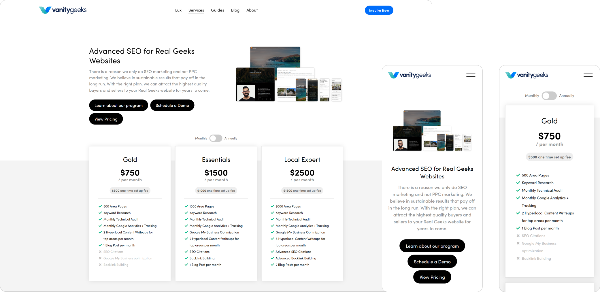
Service Pages
Designing service pages that were easy to navigate, with clear pricing tables, description of services, with jump links was a must. The mobile user was thought of during this design process, and the design is uniform across all types of services. The SEO pricing table can switch between annual and monthly pricing, and all the tables clearly describe the features of each package.
SEO Services Page

Design Services Page
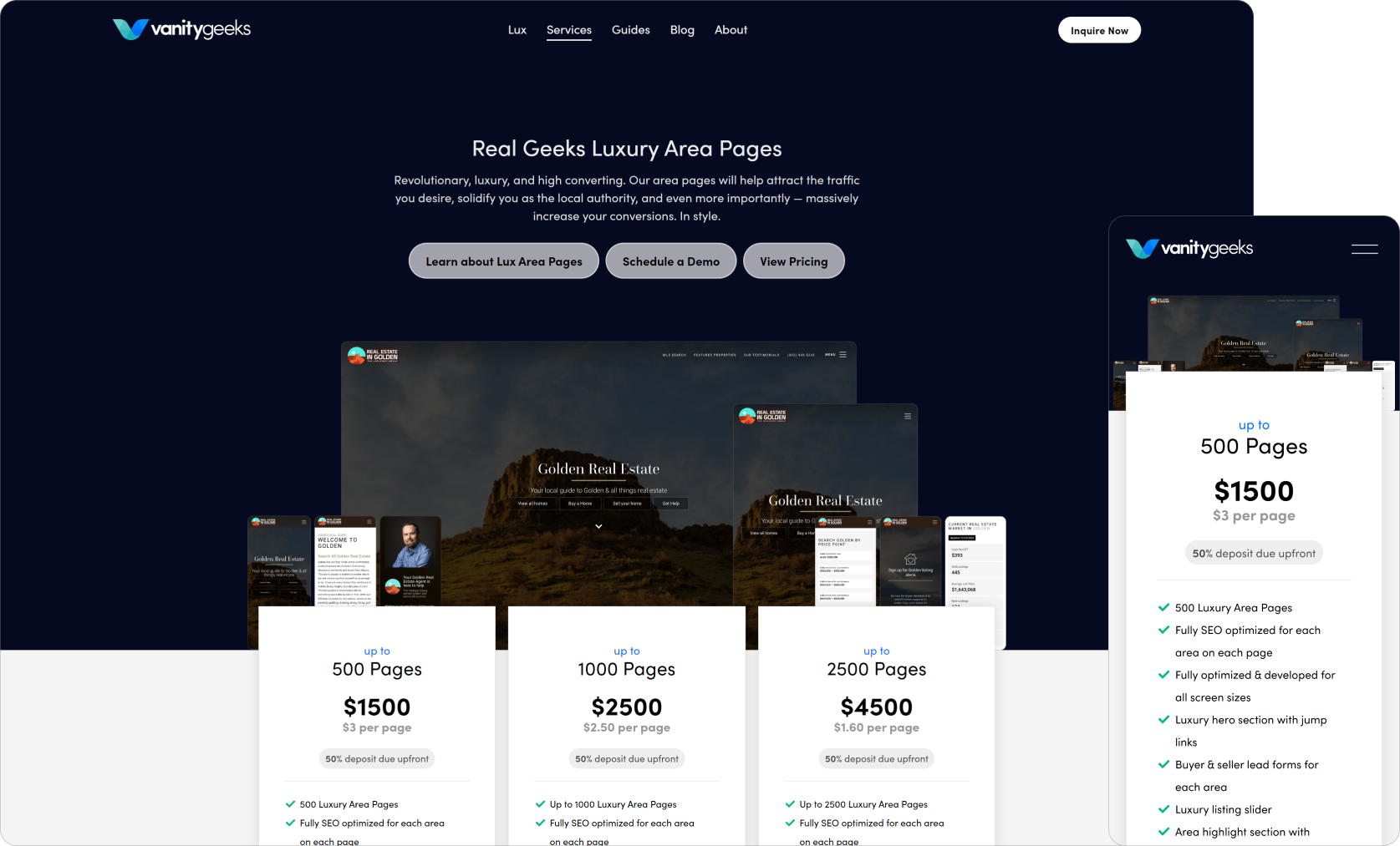
Area Page Services

Product Screens of Design Services
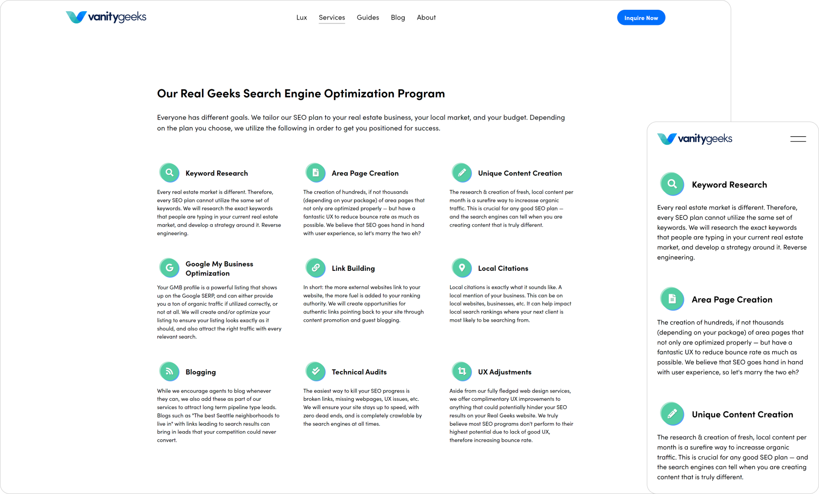
SEO Service Benefits
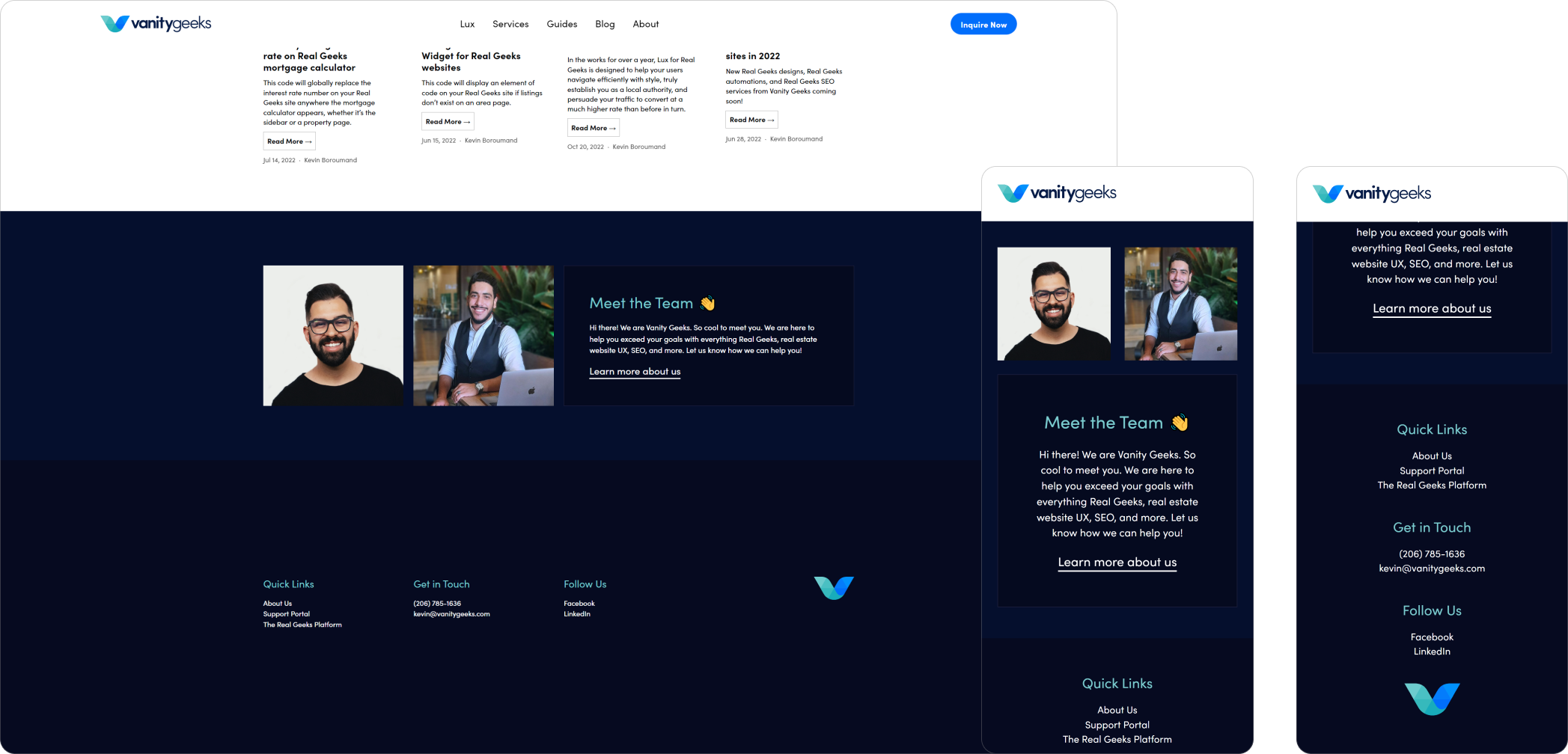
Footer

Homepage

About Page
Increase in sales, clarity, & time saved
Ever since this UX overhaul, clients have trusted the business more than ever. For months Vanity Geeks hasn’t received a single email asking about how pricing works or what is included with services — resulting in tons of time saved on an administrative level. This also has increased conversions on potential clients and has also resulted in less consultations due to increased trust. This also has overflowed into easier client-business relationships. All stemming from a new brand direction, clearly represented services, and an extremely easy to use order builder. What I learned from this project is that well executed UX can truly improve all aspects of a business.